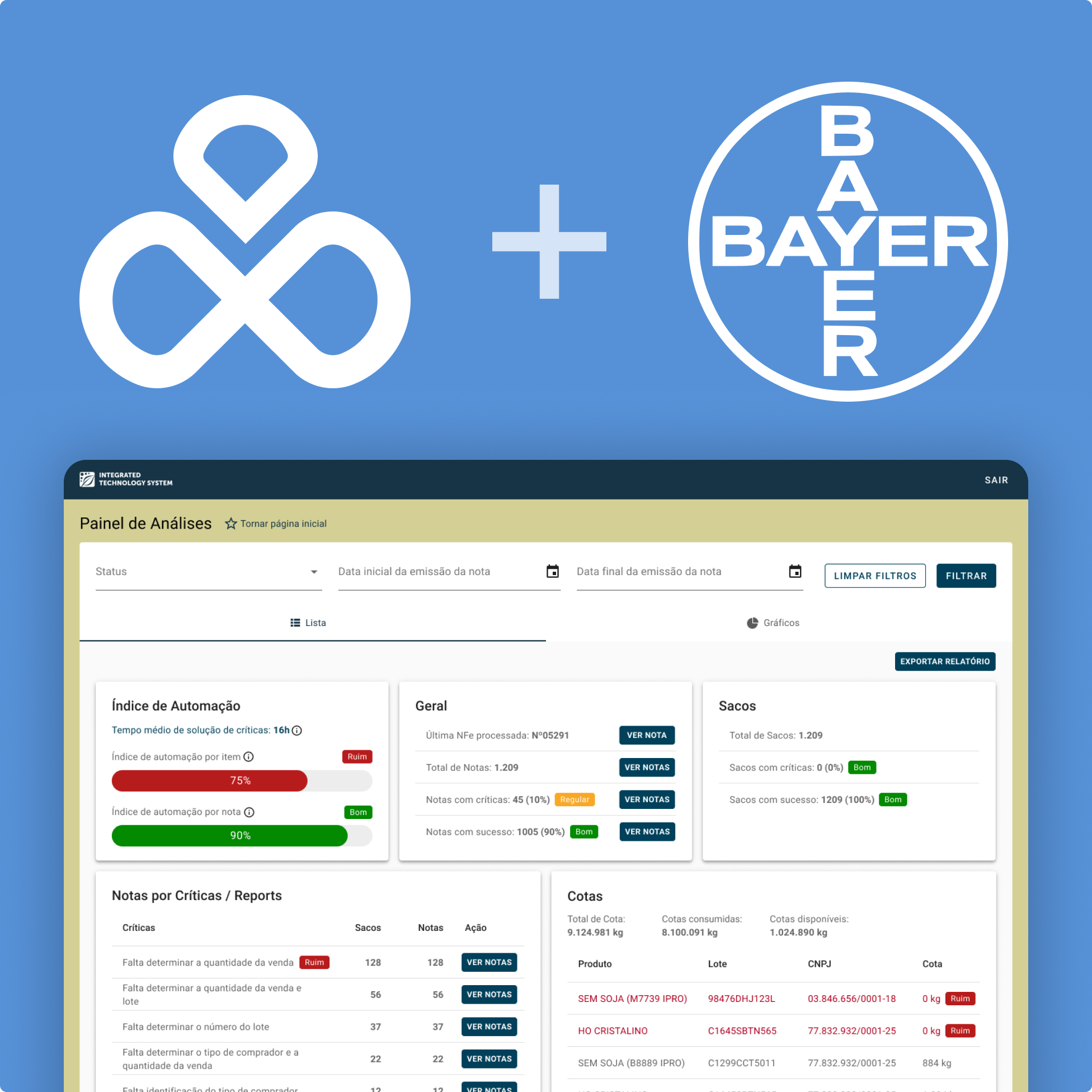
Arquivei
Overview
Role Product Designer
Design TeamMyself + 7 Product Designers
SquadMyself + Dev Lead/PM + 1 FE Dev + 1 BE Dev
DurationQ1 2021
ToolsFigma, Dovetail, Miro, Notion, Hotjar, UXCam, Google Analytics, Google Tag Manager.
Summary
We redesigned the Analysis Dashboard for Bayer's soy supply chain to enhance data visibility, streamline error detection, and improve user workflows. The redesign led to a 120% increase in daily user engagement, a 30% reduction in manual data errors, and a 45% improvement in error resolution times. These changes significantly reduced manual interventions, resulting in more efficient and accurate processes for users.
Background
Arquivei is a financial technology platform that specializes in managing and organizing digital invoices through OCR (Optical Character Recognition) technology.
By automatically extracting data from invoices, Arquivei helps businesses prevent errors, detect fraud, and ensure accurate reporting. In the Bayer soy supply chain project, this technology was used to track seed lot sales and inventory, providing stakeholders with real-time insights into their operations.
However, the original Analysis Dashboard lacked clarity and interactivity, making it difficult for distributors and regional sales managers (RSMs) to efficiently manage data, leading to frequent manual corrections and increased risks of errors and discrepancies.
The Problem
While Arquivei's OCR technology accurately extracted data from invoices, the Analysis Dashboard was difficult for distributors and RSMs to navigate. Users struggled to spot errors and discrepancies in time, leading to manual corrections, delays in decision-making, and increased risks of fraud.
The Goal
The goal was to improve how distributors and RSMs interact with the system, helping them easily identify issues, reduce errors, and manage seed lot data more effectively. We aimed to enhance their ability to make data-driven decisions while reducing reliance on manual processes and minimizing potential risks like errors and fraud.
The Solution
We redesigned the Analysis Dashboard with improved data visibility, interactive filters, and automated error detection. This allowed users to quickly spot discrepancies, streamline workflows, and take corrective actions, reducing manual interventions and improving seed lot management accuracy.

DISCOVER
To kick off the Analysis Dashboard 2.0 project, we conducted detailed research aimed at understanding how distributors and RSMs (Regional Sales Managers) interacted with the dashboard and identifying key pain points. Our research began with a series of 5 user interviews conducted via telephone, supported by quantitative data analysis from past reports.
User Interviews
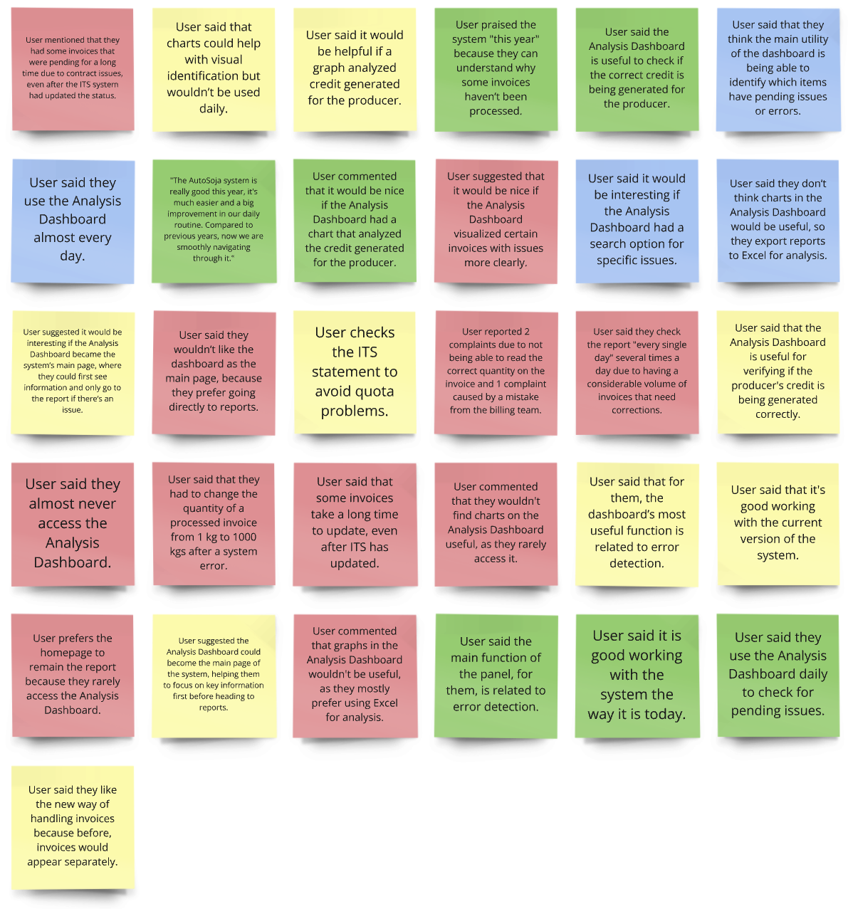
The purpose of the interviews was to understand why users were not fully utilizing the dashboard and what improvements could make it more valuable for both distributors and admins.
During these conversations, users shared critical insights about the limitations they faced, including difficulty accessing relevant data quickly and challenges in using the dashboard for real-time error correction.
One user explained, “The current system takes too long to flag issues. By the time I notice a mistake, it's already impacted my reports, and correcting it takes even longer.”
Another noted, “I mainly use the dashboard to check if invoiced amounts match up, but it doesn’t alert me to problems automatically.”
These insights made it clear that users needed a more proactive system that could catch and correct errors before they escalated.
Main Insights from the Interviews
1. Error Detection
Many users expressed frustration that they had to manually review invoices for mistakes, which was time-consuming.
2. Dashboard Clarity
Several users highlighted that the dashboard’s design was cluttered, making it difficult to quickly identify important issues.
3. Automation Needs
Distributors and RSMs wanted more automation to help flag missing or incorrect information without needing to manually sift through data.
Quantitative Data Analysis
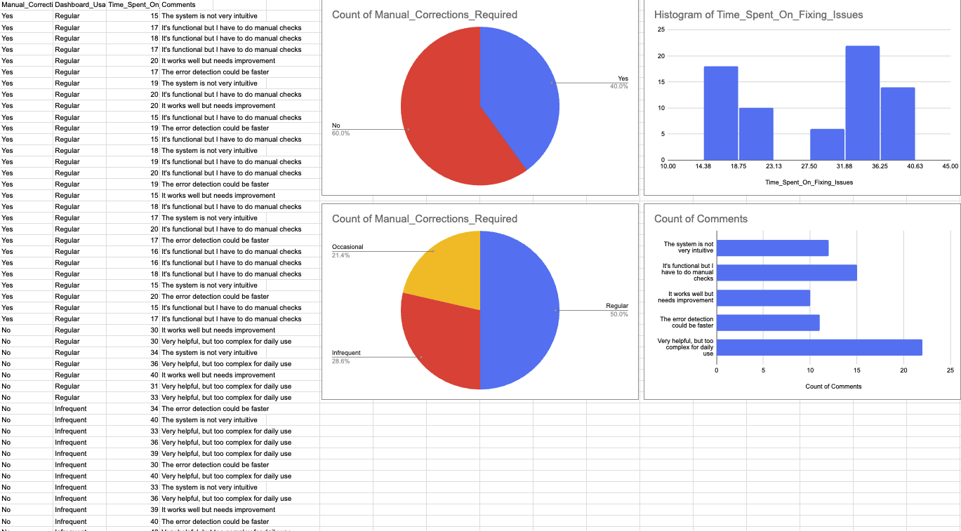
In parallel with the interviews, we analyzed the performance of the previous Analysis Dashboard across 70 reports. This data showed:
- A 40% increase in manual corrections where real-time data flags were absent.
- 50% of users were not regularly using the dashboard because they found it too complicated to navigate.
- Automated error correction systems reduced the time spent on fixing invoice issues by up to 30%.
Collaborative Problem Mapping Session
We held a collaborative session involving the project manager, developers, and client stakeholders to map out and understand the key problems identified through user research. The session focused on identifying the root causes of these issues and aligning perceptions across all teams.
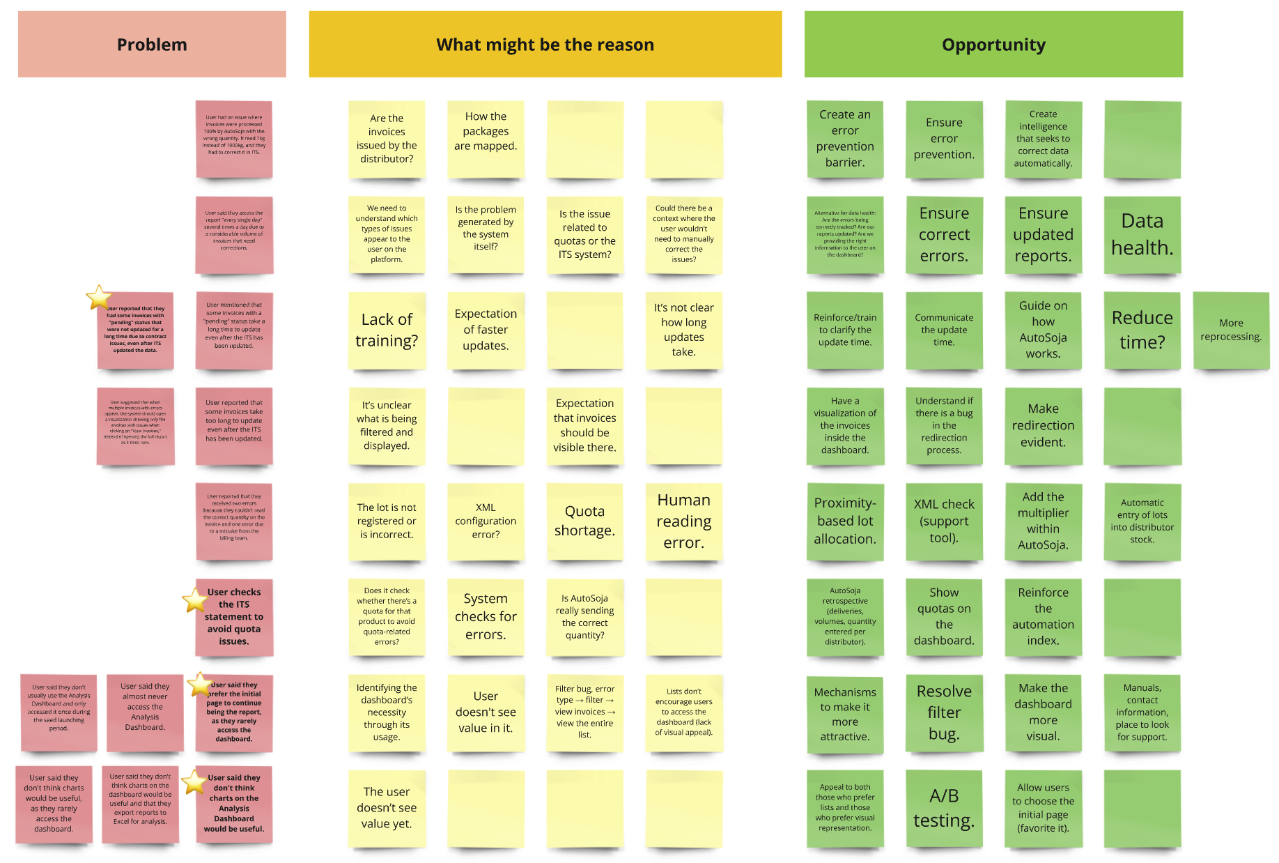
Opportunities identified during the session included:
Simplifying the Dashboard
Users found the dashboard overwhelming, with some preferring the report page as the default and feeling that charts weren’t useful. Both developers and clients agreed that simplifying the data presentation could help users focus on key tasks and reduce confusion.
Automating Error Detection
reported delays in updating invoices, even after ITS updates, and manual checks for quota issues. Developers saw this as an opportunity to introduce automation, reducing the need for users to manually track and resolve errors, streamlining the process.
Improving Data Accuracy and Visibility
The client emphasized the need for better data accuracy, especially for quota management. Automation would not only reduce errors but also provide real-time updates, ensuring that users could trust the information displayed on the dashboard.
IDEATE & DEFINE
To move from understanding the problems to generating actionable solutions, we facilitated collaborative sessions and utilized structured frameworks to ensure every potential solution was grounded in user needs and business goals.
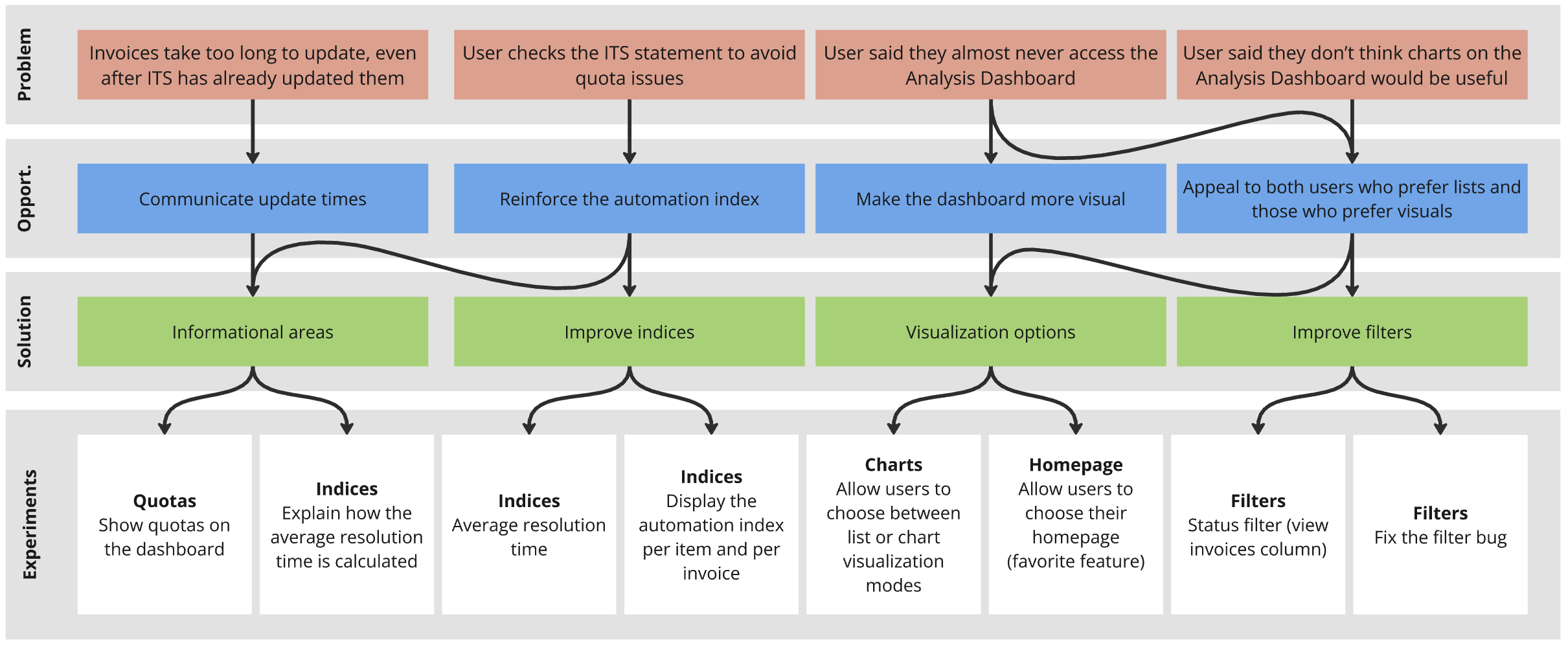
Opportunity Tree
To facilitate this process, the first workshop we ran was the Opportunity Tree, a framework developed by Teresa Torres, to break down the problems identified earlier and map them to specific solutions.
Incorporating feedback from both the team and the client, we were able to prioritize high-impact changes, focusing first on automating error detection and enhancing data visibility.
This phased approach allowed us to iterate and refine based on ongoing user feedback, ensuring that each improvement delivered measurable value.
Success metrics
To ensure each experiment was successful, we decided to establish specific metrics to track once the features were launched.
For example, we planned to monitor average resolution time to assess the effectiveness of error detection automation, track dashboard engagement by measuring the frequency of user interactions with new visualization options, and evaluate the reduction in manual quota checks to gauge the success of automating quota management.
This approach allowed us to streamline development, focusing on solutions that simplified the user experience, improved automation, and increased engagement with the dashboard.
User Flow Mapping
We also conducted a collaborative session to map out the User Flow for our primary users—distributors and regional sales managers (RSMs).
The goal was to visualize their current workflow, from accessing the dashboard to resolving errors and tracking quotas, while identifying the most critical pain points and opportunities for improvement.
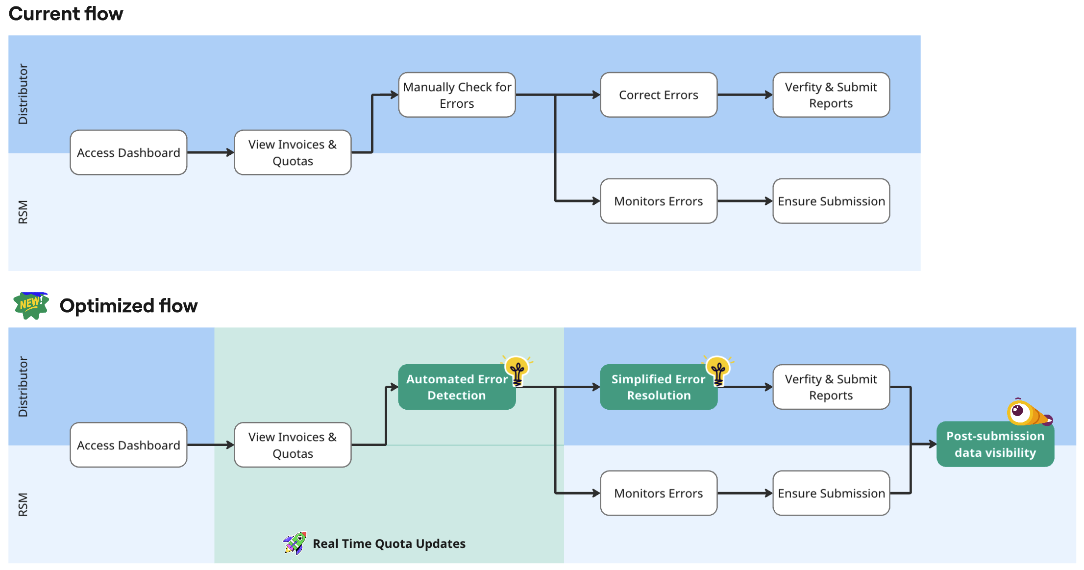
We first mapped the current journey, where distributors manually
check for errors and quotas, leading to delays and inefficiencies.
This helped us
pinpoint where users experience friction, such as manual error detection and poor data
visibility.
We then designed an optimized journey that integrates automated error detection and real-time quota updates, significantly reducing manual interventions and improving overall user satisfaction.
Mapping both journeys gave us a clear understanding of user motivations, frustrations, and opportunities for improvement at each stage. This foundation allowed us to confidently move into the next step—designing the wireframes.
Assumption Mapping
In preparation for design, we mapped out the key assumptions based on our Opportunity Tree and optimized user flow, identifying potential risks and validation plans for each key solution. This allowed us to tie our experiments directly to user needs and prioritize improvements.
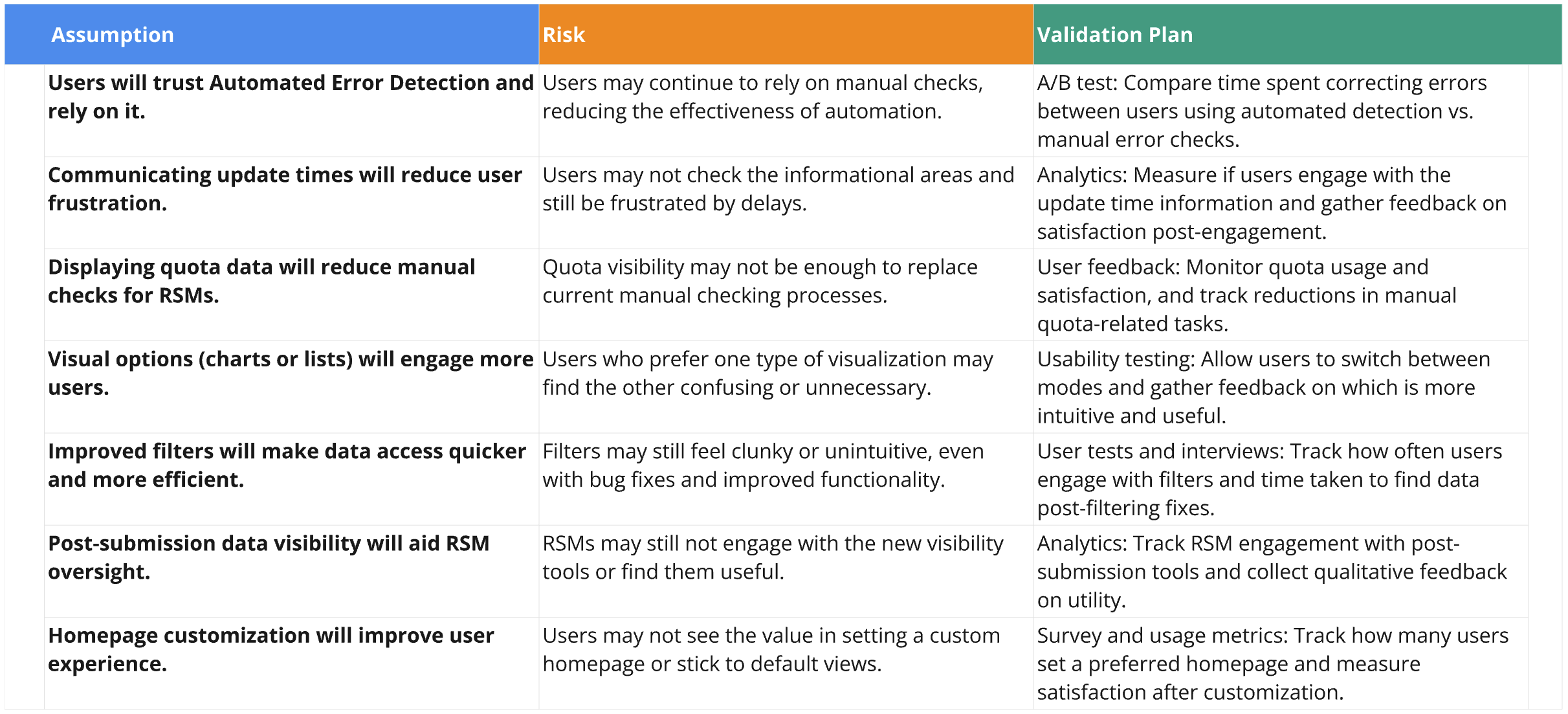
By clearly identifying potential risks and establishing specific metrics for each experiment, we ensured that our development efforts were data-driven and focused on enhancing the user experience where it mattered most. This approach helped us streamline the decision-making process, prioritize solutions with the highest impact, and track success through measurable outcomes.
DESIGN & TEST
After synthesizing insights from our user research and opportunity mapping, we proceeded to create the wireframes, focusing on translating the identified improvements into tangible design elements. This stage was key in ensuring that the proposed solutions were aligned with user needs, as identified during the Discover and Ideate phases.
Wireframes
The wireframes were a direct result of the collaborative sessions in the Ideate phase, particularly the Opportunity Tree and user journey mapping exercises. We prioritized features that addressed key pain points, such as:
Real-Time Quota Updates
One of the critical issues identified was the need for up-to-date quota visibility. This led to the design of a dedicated Quota Management Section, which gave distributors and RSMs a clear view of quotas, color-coded for easy interpretation.
Enhanced Error Detection
Based on the opportunity to automate error detection, we integrated more visible and actionable error alerts in the dashboard, allowing users to resolve issues quickly.
Customization of Homepage
Stemming from user feedback in the discovery stage, we gave users the flexibility to set their preferred homepage, such as the quota view or error tracking, providing a more tailored experience.
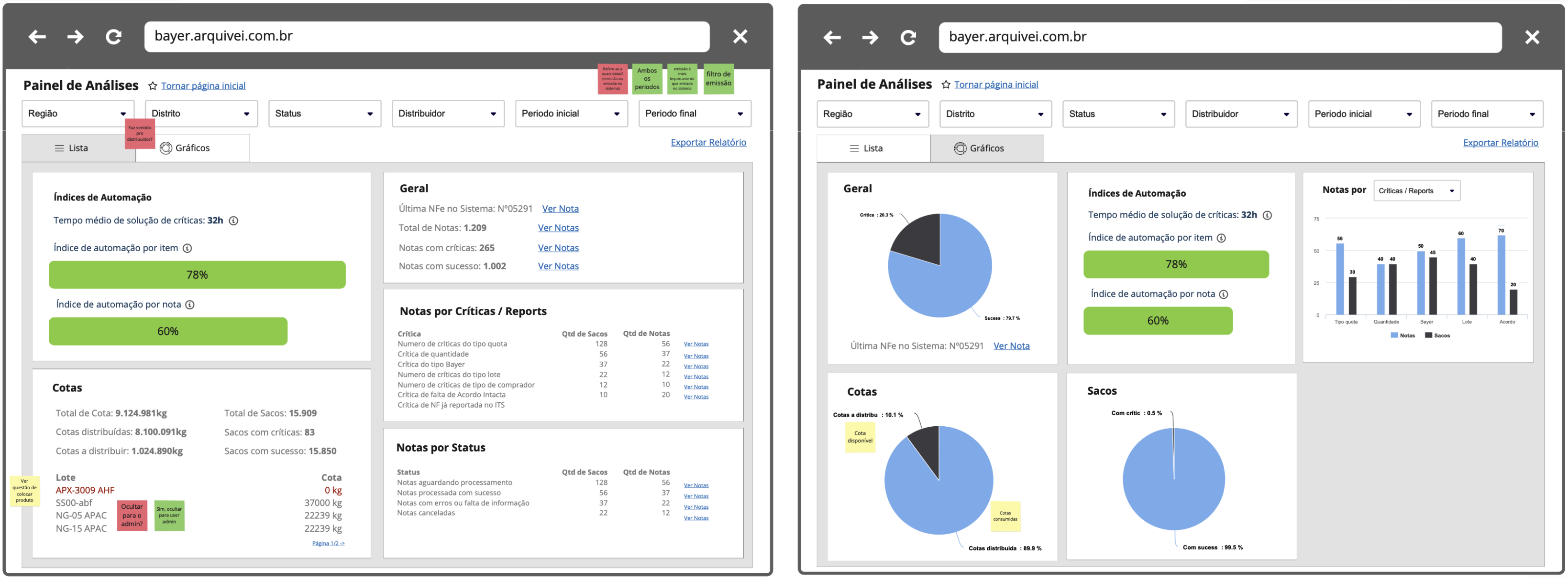
Note: I currently do not have access to the original wireframes for translation, but I am working on retrieving them for further updates.
These wireframes were refined through several design critique sessions, where developers, PMs, and clients provided feedback to ensure technical feasibility and business alignment. This collaborative process helped us iterate quickly, especially in refining the filtering system and information hierarchy.
User Feedback & Assumption Validation
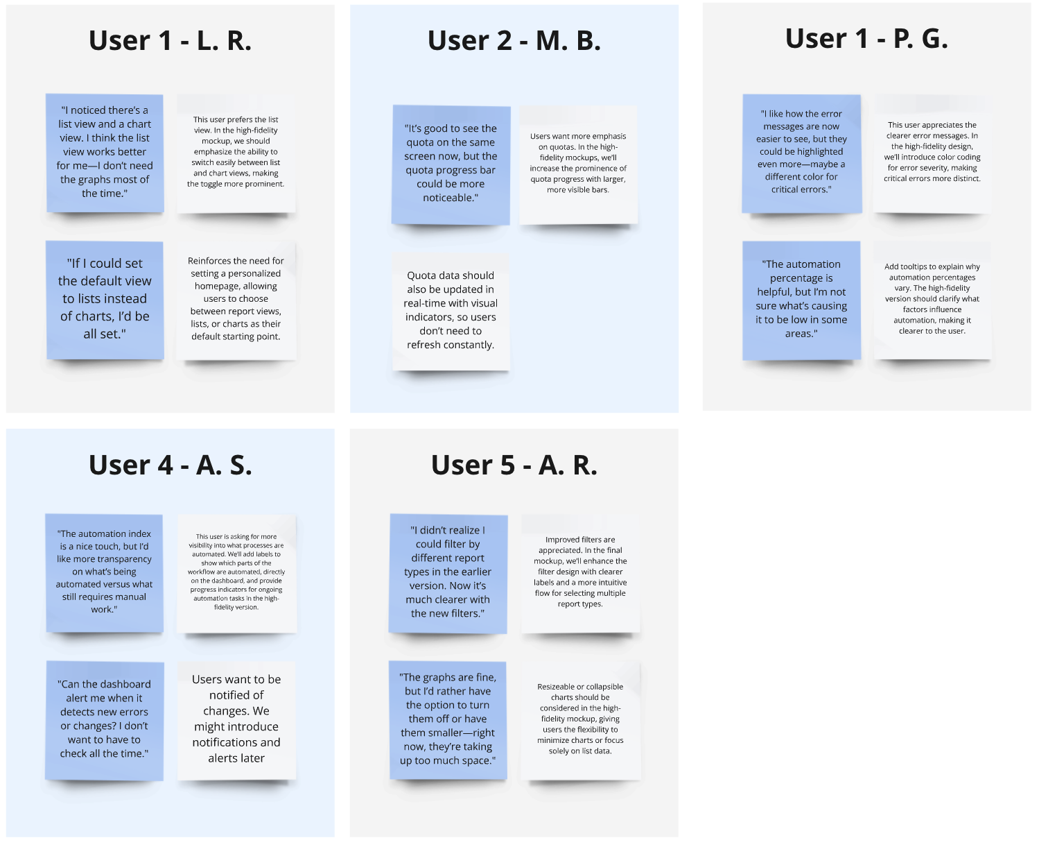
In keeping with our approach of rapid feedback loops, we presented the wireframes to a select group of users—both distributors and RSMs—testing key assumptions identified earlier:
-
Quota Visibility
Users confirmed that clear, real-time quota updates significantly reduced errors in seed distribution. One distributor mentioned, "This quota view clears up so many of the issues I was having with tracking product availability."
-
Error Alerts
Users found the enhanced error detection feature to be a significant improvement. However, some requested more prominent visual indicators. This led us to refine the alerts further, ensuring they were visible immediately upon accessing the dashboard.
-
Homepage Customization
Based on the assumption that flexible navigation would improve workflow efficiency, we validated that distributors preferred setting their homepage to either the quota or error page. This customization improved their experience by reducing unnecessary navigation time.
High-Fidelity Prototype
After refining the wireframes based on early feedback, we transitioned into the high-fidelity prototype stage.
Our main focus was on ensuring that the design updates would address the pain points uncovered in earlier sessions, such as enhancing data visibility and offering users the flexibility to toggle between list and chart views. Both distributors and RSMs had unique requirements, and the prototypes were designed to meet these specific needs.
Distinct Views for Distributors and RSMs
The dashboard was designed with two primary user groups in mind: distributors and Regional Sales Managers (RSMs). Each group had access to different data sets and features, tailored to their needs.
RSM View
RSMs required visibility across all distributors they managed.
The high-fidelity prototype provided a bird's-eye view of key metrics like quota management, error rates, and operational summaries for each distributor. This allowed RSMs to oversee performance at both a macro and micro level, making them more efficient in identifying bottlenecks or issues.
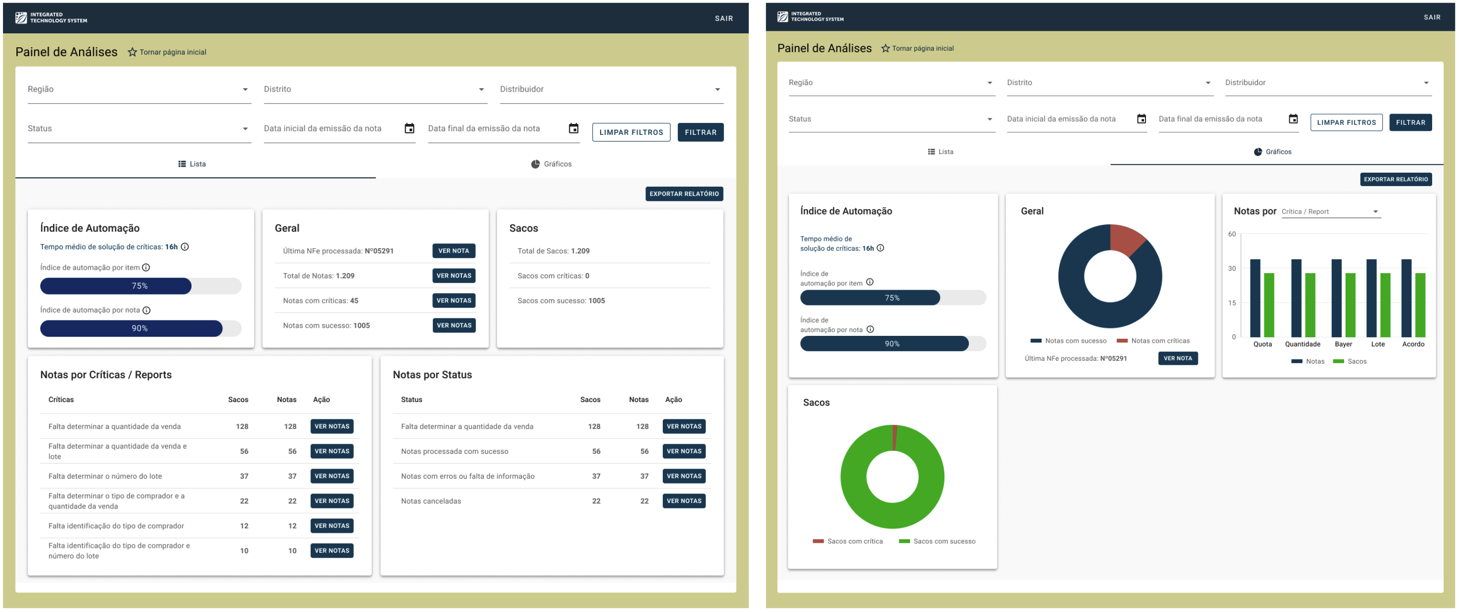
Note: I currently do not have access to the original mockups for translation, but I am working on retrieving them for further updates.
Distributor View
Distributors, on the other hand, had a more focused dashboard view that displayed only their own operational data.
Key features included real-time updates on quotas, automated error detection, and customizable data visualization options, enabling them to handle day-to-day tasks more effectively without being overwhelmed by unnecessary information.

Because we had already gathered significant usability feedback during the wireframing phase and worked closely with the front-end developer, who confirmed the ease of implementation, we decided to move forward without additional usability testing. Instead, we aimed to quickly bring the design into the live environment, where real user interactions would provide more authentic insights and allow for rapid iteration if needed.
DELIVER
The development phase was broken down into 3 sprints, each focused on different areas of the dashboard improvements. We worked closely with developers to ensure a seamless handoff and smooth implementation of the new features, maintaining constant communication to address any questions or challenges that arose during the process.
Sprint Breakdown
- Sprint 1: Focused on implementing data visibility improvements and the ability to toggle between list and chart views for both distributors and RSMs.
- Sprint 2: Introduced automation enhancements, including error detection and quota tracking, ensuring data was updated in real-time.
- Sprint 3: Finalized the polishing phase, focusing on styling, responsiveness, and ensuring all edge cases were addressed for a better user experience.
Collaboration with Developers
Throughout the development phase, I remained actively involved, working closely with the front-end team to ensure the design system elements were properly implemented.
This included updating the Figma Design System to reflect the new components, such as:
- Charts and data visualization elements: I documented detailed guidelines on styling, color use, and interaction patterns for charts. I also helped the team choose chart libraries that would best fit our use cases, ensuring they were lightweight yet flexible for customization.
- New data elements: Like the automation index, report statuses, and quota management features.
- Micro-interactions: Documenting how the UI should behave in response to user actions (e.g., hover states, data filters, and tooltips).
CONCLUSION
After delivering the revamped Analysis Dashboard, we closely monitored user behavior to assess the success of our changes. The metrics we defined during the Opportunity Tree phase were essential in measuring the success of our design. These included error resolution times, the automation index, data accuracy, and overall user engagement with the dashboard.
Here's a summary of our results:
Error Resolution Time
The average error resolution time decreased by 45% in the first two months post-launch. This was driven by improvements in automating error detection, real-time data updates, and better quota issue visibility.
Increased Engagement
Post-launch, 44% of users accessed the dashboard daily, up from just 20% before the redesign. The simplified layout and ability to switch between list and chart views were major drivers of this increase.
Improved Data Accuracy
We saw a 30% reduction in data errors requiring manual correction. This increase in data accuracy built user trust and streamlined workflow.
Automation Index
Post-launch, the automation index reached 78% for item-level error correction and 90% for note-level automation, reducing the need for manual intervention.
Time Spent on the Dashboard
On average, users spent 30% less time on the dashboard, indicating streamlined interactions and improved task efficiency.
User Satisfaction
85% of users reported a significant improvement in their workflow and satisfaction with the dashboard’s new layout and functionality.
Final Impact
The redesign of the Analysis Dashboard not only met but exceeded client and user expectations.
The simplified interface, combined with automation features, resulted in significantly reduced error rates, faster workflows, and greater user satisfaction. By focusing on real-world usage and gathering meaningful data post-launch, we were able to fine-tune the dashboard and deliver a solution that had a lasting, positive impact on distributors and RSMs alike.